Lumo (UI)
Overview
Designing a structured and trustworthy digital banking interface focused on clarity in high-density environments.
Role
UI Designer (Concept project)
Scope
Responsive digital banking platform
(Desktop · Tablet · Mobile)
Focus
UI system architecture · Information hierarchy · Component scalability · Visual discipline
Context
Financial interfaces operate in environments with high information density, where clarity directly impacts user trust.
Users need to understand balances, transactions, and financial activity at a glance. However, many contemporary fintech interfaces prioritize visual engagement over structural clarity, often introducing friction and increasing cognitive load.
Common patterns include:
-
Over-layered dashboards
-
Excessive color emphasis
-
Decorative data visualizations
-
Competing interaction priorities
While visually engaging, these approaches can make financial information harder to interpret quickly.
Lumo was designed as a structured UI system focused on organizing complex financial data into predictable and readable interaction patterns across desktop, tablet, and mobile environments.
The objective was not to simplify the data itself, but to simplify how users interact with it.
This led to the central design challenge:
How can financial information be structured so users can immediately understand their accounts, transactions, and spending patterns across different devices — without increasing cognitive load?
Design Approach
Rather than focusing on visual styling, the project centered on establishing a disciplined structural system capable of supporting high-density financial information.
The approach followed three core principles:
-
Reduce cognitive load through predictable layouts
-
Prioritize hierarchy over visual intensity
-
Build a scalable system adaptable across breakpoints
Early exploration focused on increasing visual emphasis on balances, actions, and financial highlights. While this initially made key elements more prominent, it quickly introduced hierarchy conflicts where multiple components competed for attention.
As visual intensity increased, scanability decreased. The interface became harder to interpret quickly despite appearing more dynamic.
This led to a key realization:
The problem was not insufficient visibility — it was insufficient structural balance.
From that point onward, the system shifted away from decorative emphasis and toward layout discipline, spacing consistency, and modular hierarchy.
Structural Reset
The approach shifted from visual emphasis to layout discipline.
The interface was rebuilt around a consistent structural system designed to support fast scanning and interpretation.
This included:
-
A responsive grid supporting desktop, tablet, and mobile layouts
-
An 8pt spacing system to maintain consistent rhythm
-
Defined content containers to group financial information
-
Standardized border radius and elevation
-
Component-driven layout logic
Once structural hierarchy was stabilized, financial elements could be interpreted more quickly — without increasing visual intensity.
.png)
Accounts Overview
The dashboard acts as the primary entry point for users.
Its purpose is to provide an immediate understanding of overall financial status while allowing quick access to key actions.
The layout prioritizes:
-
Immediate visibility of total balance
-
Clear separation between individual accounts
-
Direct access to primary actions (Add funds, Transfer, Details)
-
Quick visibility of recent activity
Account cards follow a consistent structure to allow rapid comparison of balances and statuses.
Supporting modules such as recent transactions and upcoming bills provide contextual information without overwhelming the interface.
Transaction Management
The transaction view focuses on clarity, filtering, and fast scanning.
Key priorities include:
-
Clear balance presentation
-
Immediate access to financial actions
-
Efficient filtering and search
-
Structured transaction rows for readability
Transactions are organized using consistent alignment, iconography, and categorization, allowing users to quickly identify payments, reimbursements, and recurring expenses.
Filtering controls were designed to refine results without disrupting the overall layout structure.
Financial Data & Insights
The insights section provides an analytical overview of financial behavior.
Instead of presenting raw transaction lists, this area focuses on:
-
Monthly expense trends
-
Category distribution
-
Fixed vs variable expense analysis
-
Contextual financial insights
Charts are designed to remain readable across screen sizes while maintaining consistency with the overall interface system.
The goal is to support decision-making without introducing visual complexity.
System Layer
The interface was built using a reusable component system to ensure consistency and scalability.
Core components include:
-
Navigation elements
-
Account cards
-
Transaction rows
-
Action buttons
-
Data visualization containers
-
Status indicators
-
Input and filter components
Component variants support different states and contexts, ensuring consistent behavior across screens and breakpoints.
Typography — Manrope
The interface uses Manrope as the primary typeface, selected for its clarity and legibility in data-heavy environments.
Its open letterforms and clear numeric characters make it well suited for displaying balances, transaction amounts, and dates across different screen sizes.
A structured typographic scale was defined to maintain hierarchy across desktop, tablet, and mobile layouts.
Special attention was given to numerical readability, ensuring financial values remain visually prominent and easy to scan.
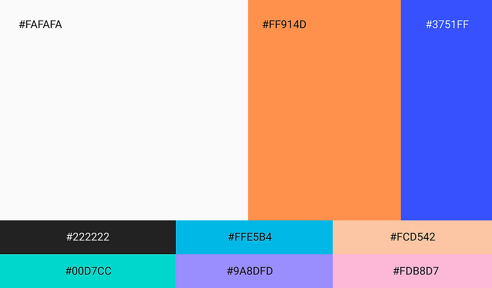
Colour System
The color system follows a 60–30–10 distribution to maintain visual balance across the interface.
-
Neutral tones provide stability and reduce visual fatigue.
-
Secondary brand tones introduce controlled emphasis across navigation and interface sections.
-
Accent colors highlight primary actions and interactive elements.
Additional supporting colors are used within charts and spending categories to help users quickly distinguish financial data such as bills, entertainment, shopping, and groceries.
Color is applied functionally rather than decoratively, supporting hierarchy, readability, and fast interpretation of information across the interface.
Iconography
Iconography was designed as a supporting layer to improve scanability and reduce cognitive effort in high-density financial environments.
Rather than acting as decorative elements, icons reinforce structure by helping users quickly identify navigation points, actions, and expense categories.
Icons are used across three primary contexts:
-
Navigation elements (Home, Accounts, Spendings, Bills)
-
Expense category indicators
-
Utility and interface actions
To maintain consistency across the system:
-
A uniform stroke weight and visual proportion was applied
-
Icons were aligned within a consistent grid structure
-
Visual complexity was minimized to avoid competing with textual information
Icons function as supporting visual cues to improve recognition speed while maintaining interface clarity and consistency.
Utility Icons:

Navigation States: Default State · Active State

Expense Category Icons:

Responsive Translation
Responsiveness was integrated into the system from the beginning.
Each breakpoint supports a different interaction context:
-
Desktop prioritizes overview and comparison
-
Tablet redistributes modules while preserving hierarchy
-
Mobile focuses on immediate access and simplified navigation
Hierarchy remains consistent across breakpoints, while layouts adapt through stacking, resizing, and navigation changes.


Outcome
The final result is a structured and scalable banking interface designed to improve clarity in high-density environments.
By prioritizing layout discipline over visual emphasis, the system enables users to interpret financial information more quickly and with less cognitive effort.
The project demonstrates how a consistent UI system — combining grid structure, reusable components, controlled color usage, and clear hierarchy — can support complex financial interactions without sacrificing usability.
More importantly, it highlights the impact of structural thinking in building trust within financial products.